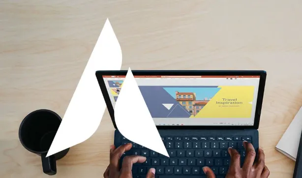
PowerPoint Online has become the go-to presentation tool for millions of people around the world. It’s free, accessible from any device with an internet connection, and packed with features to help you design professional slides. Whether you’re preparing for a big business pitch, a classroom lecture, or a project update, this cloud-based tool makes it easy to create and collaborate.
But here’s the catch: convenience doesn’t always guarantee great results. Many users unknowingly make small mistakes that hurt the quality of their presentations. The good news? These errors are easy to fix once you know what to look for. Let’s explore the five most common mistakes people make in PowerPoint Online—and how to avoid them.
Mistake 1: Overloading Slides With Too Much Text
Imagine sitting in an audience, staring at a slide packed with sentences so long you feel like you’re reading a textbook. Chances are, your attention would drift in minutes. That’s exactly what happens when slides are overcrowded with text.
Instead of filling every inch of space, focus on key takeaways. Use short phrases, simple headers, and visuals to support your spoken words. Remember: the slides are there to guide your audience, not replace your narration.
Think of each slide as a visual cue card, not a script.
Mistake 2: Ignoring Design Consistency
A slide with blue titles, another with red, and a third with random fonts—it may not seem like a big deal, but inconsistency makes your presentation look sloppy. Visual harmony is what separates polished decks from amateur ones.
PowerPoint Online offers a wide range of templates to ensure every slide flows together beautifully. These templates give you consistent fonts, colors, and layouts right from the start. Using a built-in template from PowerPoint Online is one of the easiest ways to keep your presentation professional.
Consistency builds trust, and trust keeps your audience listening.
Mistake 3: Going Overboard With Animations
Animations and transitions are fun until they aren’t. Over-the-top effects might look cool to you, but for your audience, they can feel distracting and even unprofessional. A spinning title or a bouncing chart may steal focus from the message you’re trying to share.
A smarter approach is moderation. Use animations only when they help direct attention or clarify information. For example, a fade-in effect can guide the audience through bullet points step by step without overwhelming them. Less is definitely more here.
Mistake 4: Forgetting To Use Collaboration Tools
One of the biggest strengths of PowerPoint Online is its collaborative nature. You and your team can work on the same presentation simultaneously, leave comments, and review changes in real time. Yet, many people still rely on emailing files back and forth—leading to version confusion and wasted time.
To avoid this, always share a single presentation link with your collaborators. Assign editing or viewing permissions depending on their role. This way, everyone works on the most up-to-date version, and feedback stays organized in one place.
Mistake 5: Overlooking Accessibility
Accessibility is often treated as an afterthought, but it should be at the heart of your design process. A slide that looks great to you may be hard to read for someone with vision challenges. Poor color contrast, tiny fonts, or missing alt text for images are common accessibility mistakes.
PowerPoint Online actually comes with an accessibility checker that highlights issues you might miss. Use high-contrast color schemes, readable fonts, and add alt text to images. By making your slides accessible, you ensure everyone can engage with your message—not just some.
Why Avoiding These Mistakes Matters
Each of these mistakes affects your presentation:
- Text overload
- Inconsistent design
- Excessive effects
- Poor collaboration
- Lack of accessibility
When you avoid them, the difference is remarkable. Your slides look cleaner, your delivery feels smoother, and your audience stays engaged from start to finish. Plus, working smarter with PowerPoint Online actually saves you time. Templates, collaboration tools, and accessibility features are all designed to make your workflow faster and more efficient.
PowerPoint Online is a powerful, user-friendly platform—but only if you use it wisely. Avoid overcrowding your slides, stick with consistent designs, use animations thoughtfully, embrace collaboration tools, and never overlook accessibility.
By steering clear of these five common mistakes, you’ll not only save time but also create presentations that leave a lasting impact. The next time you log in, remember: simplicity, clarity, and professionalism are your best allies.
FAQs
- Is PowerPoint Online free to use?
Yes! PowerPoint Online is available for free with a Microsoft or WPS account. You can create, edit, and share presentations without downloading software. - Can I use PowerPoint Online offline?
No, PowerPoint Online is cloud-based, which means you need an internet connection. However, you can download your file for offline use with the desktop app. - Are the templates in PowerPoint Online customizable?
Absolutely. You can change fonts, colors, layouts, and even add your branding. The templates are just starting points—you can tailor them however you like. - How do I collaborate with others on PowerPoint Online?
Simply share the link to your presentation. You can choose whether collaborators can edit, comment, or view only. Changes are updated in real time, so everyone stays on the same page. - Does PowerPoint Online support multimedia elements?
Yes, you can insert images, audio, and video directly into your slides. The platform also supports animations and transitions, though it’s best to use them sparingly.