
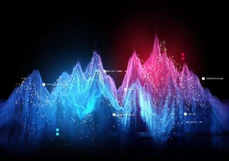
Data and art might seem like two very different worlds—one rooted in numbers and logic, the other in emotion and aesthetics. But in today’s digital age, these worlds are blending in fascinating ways. Artists, designers, educators, and even marketers are discovering that data isn’t just for analysis anymore. With tools like a chart generator, it’s now possible to turn complex information into beautiful, expressive visuals that tell compelling stories.
At its core, data visualization has always been an artistic practice. Even traditional graphs require choices in color, layout, and form. But with modern tools, these choices have expanded into endless creative possibilities. Today, creators can design custom graphs that are not only informative but also visually stunning—allowing data to serve as both a storytelling medium and an artistic canvas.
As audiences grow more visually driven, the demand for unique, meaningful, and aesthetically powerful data art is rising. Whether for social media, digital installations, educational materials, or brand storytelling, custom graphs offer an exciting way to combine creativity with clarity.
Why Data and Art Belong Together
The fusion of data and art works because both are forms of communication. Data provides the structure, while art provides the emotional impact. When combined thoughtfully, they can transform abstract concepts into something engaging and accessible.
1. Data Makes Art More Meaningful
Artists today often incorporate real-world data to convey themes such as climate change, social issues, human behavior, or cultural trends. This grounding in reality adds depth and credibility to creative work.
Think of:
- Climate visualizations showing rising temperatures
- Social justice charts highlighting disparities
- Abstract installations using real-time datasets
These visual stories often resonate more deeply than words or raw numbers alone.
2. Art Makes Data More Engaging
People process visuals 60,000 times faster than text, according to research on information processing. When data is presented in a beautiful or unconventional way, viewers are more likely to engage, share, and remember the message.
The Rise of Custom Graphs as a Creative Medium
Traditional charts—line graphs, bar charts, pie charts—are still useful, but custom graphs are pushing boundaries. Creators are experimenting with:
- Unique shapes and patterns
- Enhanced color gradients
- Dynamic animations
- Interactive elements
- Non-linear layouts
This allows data to form the basis of artistic expression rather than merely delivering information.
Why Custom Graphs Work So Well
Custom graphs blend precision with personality. They:
- Highlight important insights in visually compelling ways
- Allow creative interpretation while keeping data accurate
- Encourage deeper understanding through interactive exploration
- Turn ordinary data into share-worthy art
Brands, content creators, and educators especially benefit from these designs because they make complex ideas more relatable and appealing.
Tools Empowering the Data-Art Revolution
Digital tools are a major catalyst in making custom data art accessible. Graph makers and visualization platforms now offer advanced customization options that were once only available to professional designers.
What Modern Graph Tools Offer
- Custom color palettes
- Shape modifications (curved bars, radial charts, abstract polygons)
- Unique textures and patterns
- Animated transitions
- Interactive data points
- Export options for web, print, and social media
Creators no longer need coding knowledge or professional design software to produce visually stunning graphs.
Where Custom Graphs Are Making an Impact
Custom data visualizations are being used across industries—and often in unexpected ways.
1. Creative Marketing Campaigns
Brands use artistic graphs to:
- Communicate achievements
- Present survey results
- Tell brand stories
- Create eye-catching social media content
Artistic data visuals stand out in crowded feeds and encourage higher engagement.
2. Education and Learning
Teachers and students use custom graphs to make lessons more interactive and enjoyable. Data becomes less intimidating when presented in creative, playful formats.
3. Digital and Fine Art
Many modern artists now use datasets to create:
- Gallery installations
- Digital motion graphics
- NFT and generative art pieces
- Visual storytelling exhibits
The fusion of data and creativity gives their work both meaning and modern appeal.
4. UX and Product Design
Interactive dashboards and infographics rely heavily on creative data visualization. Designers incorporate aesthetic elements to improve the user experience and communicate insights more intuitively.
How to Use Custom Graphs for Creative Expression
You don’t need to be a professional artist to use data creatively. Here are actionable tips to make your custom graphs visually striking and meaningful:
1. Start With a Clear Theme
Identify the story behind your data. Is it growth, decline, contrast, or distribution? Your design choices should match the emotional tone.
2. Choose Shapes Creatively
You’re not limited to standard bars and lines. Consider:
- Circular patterns
- Organic shapes
- Isometric 3D bars
- Radial timelines
- Layered waveforms
These instantly elevate the visual appeal.
3. Use Color Symbolically
Colors convey emotion.
Warm colors = excitement
Cool colors = stability
Neutral tones = sophistication
Pick palettes intentionally to match your message.
4. Add Texture and Pattern
Gradients, shadows, and patterns add depth and personality, making your graph feel more like artwork.
5. Introduce Motion
Animated graphs amplify both storytelling and engagement. Use fade-ins, moving points, or transitions to create a dynamic experience.
6. Keep Data Integrity Intact
Even artistic graphs must stay accurate. Maintain proportion and scale to preserve credibility.
The Future of Data as Art
As AI tools and visualization platforms grow more advanced, expect even more innovative forms of data-driven art:
- Real-time data murals
- Personalized infographic art
- AI-assisted generative visuals
- Immersive VR data experiences
The line between science and art will continue to blur, offering endless opportunities for creative expression.
Final Thoughts
The intersection of data and art is a growing creative frontier. With custom graphs, creators can tell powerful stories, inspire emotion, and transform raw information into visually captivating masterpieces. Whether you’re a marketer, educator, designer, or artist, embracing custom data visualization opens the door to new forms of expression—and tools today make it easier than ever.